
PROJECT BREAKDOWN
Provided Services
Logo
Brand Guide
Menu Design
Employee Wear
Competition & Concept
There were minimal brunch locations on the Gulf Coast, and the nicer dining spots were connected to hotels, sometimes proving intimidating to non-residents. Existing restaurants utilized trendy industrial modern themes that complemented the local oil exports. However, oil wasn't the attraction for those on a quick getaway to the beach. The goal was to establish a brand that felt refreshing and clean, emphasizing the elegant English traditions of High Tea. This approach made sense, considering that for some, the Texas coast is often as far as they’re willing to travel, which is where I can take advantage of the coast having a similar environment to the UK where high tea is tradition.
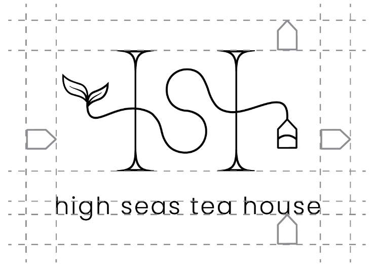
The concept aimed to mirror the menu selections, featuring local fish and native plant species. Morning Glories, abundant along the Texas coast, became a central theme, seamlessly integrating with tea flavors and contributing to the brand's overall identity. The personality strived to be luxurious, modern, feminine, simple, yet whimsical. The objective was a timeless mark reminiscent of handbag monograms like Louis Vuitton, creating relatability for the target market and adaptability to various patterns.
Brunch Café
High Seas Tea House
My illusory concept from way back when I was enrolled in culinary school, I created my dream restaurant, a place I wish existed when visiting the coast of Corpus Christi. I wanted to bring my concept to life and create its brand for my own benefit and practice.
This brand needed some roots as a fresh new business. I needed to design a name, logo, brand look and feel, employee wear, store stationary items and tie it all together into a brand book. The overall concept had to be a niche market; real world brands have meaning and story that gives a value to their average customer. Though similar brands will exist, it had to be memorable. I had to create consistency through touch points — direct through the experience and decide what the target audience would want to see.


Direction
My thoughts were to mimic natural colors and think about interior design. I drew inspiration from large window design, bringing in a lot of light to the concept. The windows brought along the idea of atriums to tie in lots of plant-life to relate to the tea more. I turned to modern teapot and teacup design to bring in whimsical flavor and round edges. I tried to focus on feminine fonts with thin hairlines and weights to create a delicate atmosphere. Ocean patterns gave several ideas for iconography and logos.

Ideation
The process began with a recognition of cliché beach-themed décor and a conscious effort to brainstorm alternative ideas for a seaside establishment. I created a word list to filter out common concepts, and this exercise not only helped eliminate generic themes but also inspired potential names like Seaside, Seaport, Sea Bell, Coastal, and High Seas. The goal was to strike a balance between a modern, whimsical vibe and avoiding cheesiness. The similarity between Sea and Tea led to the consideration of names like Teaside and High Sea. Sketching iconography and experimenting with monograms and type lockups preceded the final decision, with careful consideration given to potential confusion with existing brands like High-C. Ultimately, “High Seas” was chosen, drawing a connection to the elegance of “High Tea” while avoiding brand ambiguity.


Digital Drafts
Pleased with the chosen monogram, my focus shifted to typeface pairing. Opting for a contrasting sans serif complementing the serif "H," I successfully integrated the simpler "S." The challenge lay in ensuring the tea leaf, also doubling as a fish tail, was distinct, and the simplified tea bag was not overly basic.
After subtle adjustments to the fish tail and tea bag, I achieved the right balance without complicating the design. Fine-tuning the spacing resulted in the final logo. Additionally, I enjoyed creating supporting iconography for use in patterns and stationary, maintaining consistency with the overall mark's style.


Typography & Color
To mimic the logo type lockup, the headers and subheads would be best in the same setting to match. Poppins makes for a very legible setting even in the light setting. Though with the body copy, I wanted to mimic the serif “H” and I went with the same font “Meno Banner” that I used to design it.
I wanted to keep the colors simple, and be able to use them in the interior design as it’s a concept that hasn’t been constructed yet. I needed calm colors that also drew inspiration from the location. I had originally anticipated a lighter green option, though as a coffee and tea establishment, it could compete with the popular Starbucks.


Brandbook
This example shown is a simplified brand book of guidelines for clients to fully grasp their new design. They’re able to share this with new designers to further sell their brand and market the establishment through merchandise and social media based on typography, colors and patterns.
Wrap
This project holds special significance as a manifestation of a longstanding passion. Having transitioned from a four-year career as a Pastry Chef to a Graphic Designer, I carried the concept for this establishment with me for years. Bringing it to life and developing its brand has been a rewarding experience, providing a sense of fulfillment and completion.
The true joy of this endeavor lay in envisioning the target market’s experience within the space and tailoring the design to their preferences. Recognizing that the strength of an establishment’s experience is intricately tied to graphic design, followed by interior design, service, and food, I ensured a holistic approach in crafting this brand.
Fueled by my love of food, this project stands out as one that authentically reflects both myself and the prospective clientele I aspire to collaborate with. Ultimately, my goal is to assist clients in narrating their story effectively and generating revenue through engaged customer experiences.
Interested in working with me?
Ready to boost your brand for greater sales? If you need a captivating identity that resonates with your audience, let's connect. I specialize in revitalizing brands, crafting compelling visual stories that resonate with your target market. Whether it's a logo tweak or a full brand overhaul, I'm here to enhance your market presence. Don't settle for a dated brand – let's create an identity reflecting your unique story and propelling your business forward.


